Go Back
 |
|
Spreadsheet || Write in it || Tidying up || Make chart || Kind of graph || Axes || Labels || Improving the graph || Conclusion || Pie charts
|
Go Back |
|
1. Setting up your page with a spreadsheet
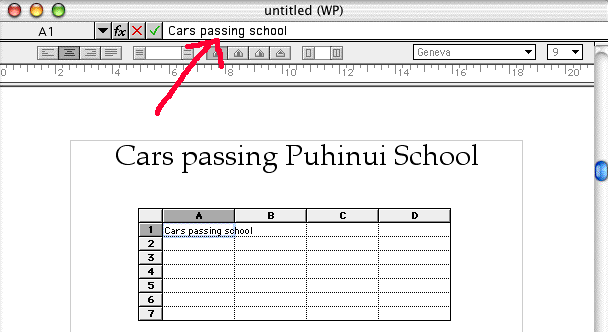
Open a Word Processing page, and type the title for your graph. Centre it, and make it larger, and bold. Then open the toolbox,

and select the spreadsheet tool (top right, with numbers on it). Click and drag it across the page to make a small spreadsheet.
Now you can start by putting headings in your spreadsheet. It should have one row of headings along the top, and one down the left. To write in a cell, click into it with the spreadsheet tool, and write. The writing does not appear in the cell - it is up the top (where the red circle is). But when you click into the next cell, you will see it in the right place.
3. Make your spreadsheet the right size, and tidy it up
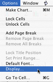
When you have put in your headings, then you can make the spreadsheet the right size. Go to the draw tool (the arrow), and drag in a corner to resize it. Then you can get rid of the grey bits by clicking into the spreadsheet (check you are in the spreadsheet tool), and going Options - Display. You will get this window below.
 ...............
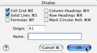
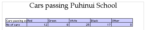
Make it look like this - tick solid lines, and untick column headings and row headings. Then click OK. Now your spreadsheet will look like this.
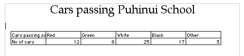
Now you need to make sure you are in the spreadsheet tool, and click and drag to select (highlight) all the cells in the spreadsheet. Make sure you select every cell with data in it, but no empty cells. (The first cell you select will look white still - don't worry about that).
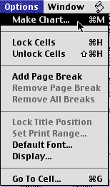
Now go Options - Make Chart and you will get the Chart Options window open on your screen.
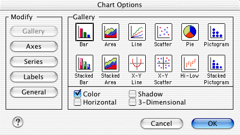
In the first window, you can decide what sort of a graph to make. Here we have clicked on the bar chart. Don't select colour if you are going to print the graph - only if you will be using it on screen. The meain ones you would use would be bar graphs and pie graphs.
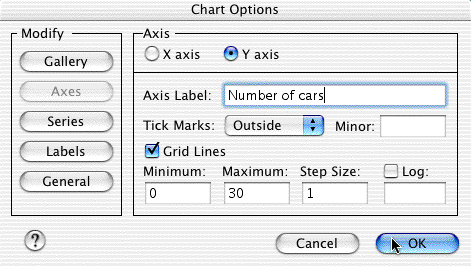
Now click on the Axes button. First of all click on the Y axis (this goes up and down - the vertical axis). Give it a label so it makes sense. Here, we have called it the number of cars. Then you put the number that will be at the bottom left corner of the graph (usually it is 0) for minimum, and then the maximum number shown on the axis (it may be a little bigger than the highest number in your data), and then the step size. If you are dealing with small numbers, keep it to 1 or 2. If you are dealing with hundreds, make it 5 or 10 or 25.
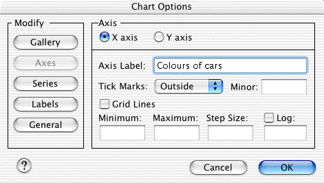
Now click on the X axis button. This is the across the page axis (the horizontal axis) of your graph. All it needs is a label, because each colour from the spreadsheet table will have its own bar, and you need to give it a category (such as colours of cars or types of vehicle or whatever).
You only need to click on the Series button if you have numbers for one of your headings in your spreadsheet table and you need to tell the chart maker to ignore these.
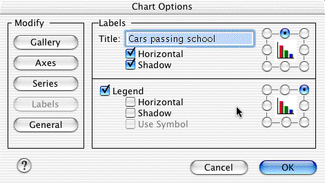
Otherwise, click on the Labels button. You may want to add to the heading, and give it more detail to explain the graph, and to make the box it is in shadowed.
When you are done, click the OK button to see your graph.
Before you print out the graph you need to tidy it up a bit. If you need to go back and change any of the options, just double click on the graph and the Chart Options window will open up again.
Move your graph around by the middle, and resize it by dragging a corner. Click on the title to get round hollow handles, and you can change the font and size of the heading.
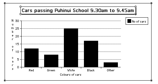
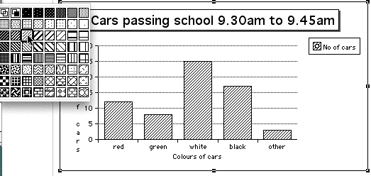
Click on the black square in the key saying "No of cars", and you can change the fill of the bars in the graph. You make a small white circle in the box when you click into it, and then you can go to the paintpot patterns, and choose another pattern.
9. Finishing your page with a conclusion
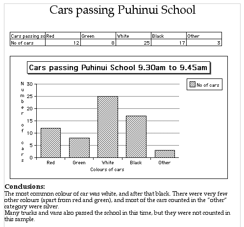
A graph is of no interest on its own - you have to look at it and interpret what it tells you. Use the return key to move down below the graph, and make a heading "Conclusions". Now you need to write down what the graph shows, like the example below.
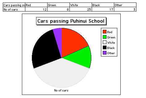
You can also make this data into a pie chart like the one below.
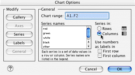
If you get something strange like the results below, you need to click on the Series button in the Chart Options window.
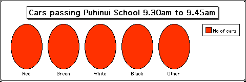
Now change the button saying Series in to select Columns, which will show the series in the list to the left. If your graph has only one entry in the series names list, it will not show up as a pie graph.