 Go
Back
Go
Back |
|
New page || Content then format || Selecting text || Changing fonts || Serif and Sans Serif || Size of text || Centering and justifying || Text ruler options || Do's and Don'ts
|
Go
Back |
|
In the dock, open AppleWorks by clicking on the icon once. If nothing happens, check to see if there is a tiny black triangle next to the icon in the dock (you get that when the programme is open). You will probably find that the programme is already open on your computer. Go File - New .. to open a new page. Choose Word Processing to get a new page to work on.
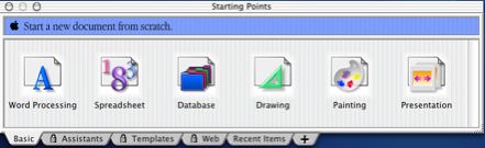
You can also open a new page from the starting points window, which you can see above.
2. Write the content, and THEN format it
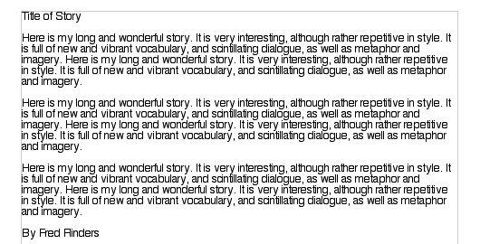
Before you start thinking about what font you want, and how you want your heading to look, you should write your work, just in whatever font and size comes up when you open the page. DON'T start changing fonts and sizes before you start. It will cause all sorts of problems later on, and is a waste of time.
Your piece of work should look like this when you have done. The only formatting done as you write is to hit Return twice to start new paragraphs.
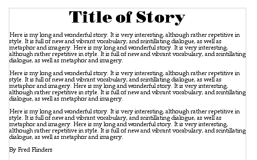
Now you are ready to start formatting it, and changing fonts and sizes. You can make it look like this in a couple of quick moves. Remember, do your writing first, and then fancy it up with changing fonts and sizes.
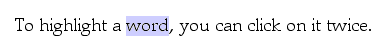
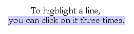
When you decide to change a section of text, you must select it first, so that it is highlighted in colour. You can do that by dragging, but also by clicking the mouse a certain number of times.
Once you have selected the text (say for example the title) you can change the font by going to the top of the document where it shows the font, and holding the mouse, and sliding up and down to choose a font.
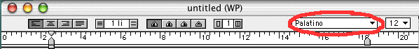
Or, you can hold the mouse on the A to the left of the button bar (if it isn't showing, go Window - Show button bar) and holding down the font shown and sliding up and down to choose another font.

You can also change the size (slide up and down the 12) the style (slide up and down the A) and the colour of the text.
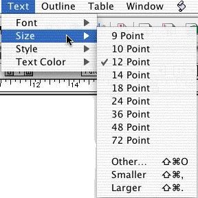
Another way to change the font is to use the menu bar and under Text, change the Font, Size and Style. That makes a total of four different ways to do the same thing!
The main rule to use when selecting a font is Can you read it quickly and easily? If the answer is no, DON'T use that font, no matter how cool it looks! Some fonts should only be used for headings or special words. There are only a few fonts that are clear enough for the body of the text.
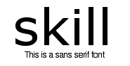
Serifs are the little bits that go at the ends of letters, so a serif font is a font (like this one) that has little bits at the ends of the letters. A sans serif font (sans means without) doesn't have those bits - so it is completely plain. Look at these examples.
 .......................
The rule is - use a serif font when you are going to print your work out - it is easier to read on paper. Use a sans serif font when your work is to be read on a computer screen - it is easier to read on screen. Simple! Now look at these four texts, and see what you think. Only one of them passes the "easy and quick to read" test.
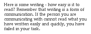
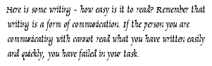
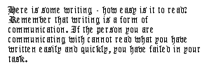
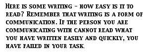
The first sample (in Palatino) is the only one that passes. The others are much harder to read. You should be especially careful not to use all capitals - that slows your reader down by a huge amount.
If you are printing out a story, the body of the text (the main writing) should be between 10point (a bit small) and 18point (a bit large). Usually it should be 12 or 14 point. Anything larger than that is not appropriate except for headings.
If your work is to go on screen, it will usually need to be 14point or larger. Don't make it so big that you have to scroll, however.
If you are working in columns, (eg for a newspaper), the guide is that the font and size should average about eight words in each line. Too many words means it is hard for the eye to find the start of the next line, and too few means you have to read in a jerky way which is very annoying.
7. Centering and justifying text
To centre your heading, click your cursor into the heading, and use the centering tool in the ruler (or in your button bar). If you can't see the text ruler, go View - Show Rulers, and it will appear at the top of your page.
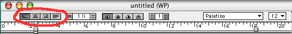
The left choice lines up your text with no gaps along the left side of the page (called left justify). The next one centres each line of text, and you often use this for headings. The third one lines everything up with the right side of the page (called right justify) and the fourth one makes both the left and right edges line up evenly. The last one is sometimes used for newspaper columns, but mostly it is the first two that are used.
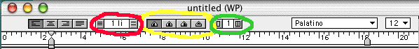
The red circled area allows you to space lines of writing more widely apart. Click to the left to make spacing smaller, and to the right to make it wider.
The yellow circle shows tabs you can pull down to your text. Mostly use the first one on the left, and just pull it down to the ruler where you want it to go. Then pressing the tab key will take you to that part of the page. To get rid of one of these tabs, simply drag it down off the ruler.
The green circled area allows you to make columns on your page. Click to the left to make fewer columns, and to the right to make more columns. (When writing in columns, you work down each column in turn, not across the page).
DO:
DON'T